Columnist Judith Torres With Heidrun Milan
Images Martijn de Geus and Wei Yi

Project Rating:
Judith Torres: ![]()
Heidrun Milan: ![]()
“I really love that project. It’s a wonderful space, I still to this day haven’t seen anything like it,” says Han Zhang. “It was a very challenging site. Three very narrow long shopfronts, barely any sunlight and also, it was at the end of the road of this commercial strip. All things were going against it. And they wanted to make this amazing space, a restaurant that was unique to the city.”
‘They’ are the clients, three young women, classmates, who just adore Japanese food and culture. One was a photographer, one an Ikebana-flower artist, and the other, a manga fan. Their vision: “A refined space in which their passions for Japanese culture could come together, including a sushi bar, restaurant, tatami rooms, a gallery, and coffee bar.”
“This was a space that had a tremendous amount of structure. It was only three stories high, but it was a very over-dimensioned structure. We were honestly thinking, ‘Oh, oh, this is going to be a challenge.’ That process was quite defining for Martin and me.”
‘Martin’ is Martijn de Geus, Zhang’s partner and co-founder of 汉荷设计 (maison h), and is also her husband.
Heidrun Milan and I were interviewing Zhang, and we had just been talking about the challenges husbands and wives have working together, and how she and de Geus resolve disagreements on design. “It’s next to impossible not to disagree unless you are identical persons,” Zhang says, “(but) disagreements often produce the best results.”
De Geus agrees. “It’s very difficult how two people work together. Because I do more of the design work, normally, I direct more of the design team. With Han, she always keeps me in check. She would always say, ‘Martin, this is really shit, why are you doing that?’ and I would think it’s amazing. The next day I realize, yes, it’s bad. I can do better.”

How the design came to be
Zhang recounts how it went: “We had a different idea for it at the beginning. Something that was like floating, shifting platforms because of the limitation of the space. We tried it, modeled it, and said, ‘It’s not going to work. There are too many obstructions.’
“It tortured us. This often happens in the process—we get tortured. I tell Martin, ‘Okay, let’s go back to the basics. Okay. What are the problems, and what is it we need to create for this space to cancel the problems?’”
“They had one problem,” says de Geus, “which was there were almost no windows, and the space was very deep and narrow. That’s terrible for a restaurant because everybody wants to sit next to a window, have a view and be seen, and look at other people.”
“Then he had this great idea that we would create artificial walls with very big windows, views, and vistas, within this space to give it that dynamic feeling that it needed. It was almost like, outside the wall and inside the wall could be two different worlds!”
As soon as he hit on the concept, the ideas kept flowing. The Dutch architect who left his hometown in search of new ways of thinking and settled in Beijing recalls why it suddenly became so easy: “I had been thinking about this theme of playfulness, of endless space, of gardens for so long in the back of my head that when the concept came, it was actually quite fast. I had the idea, we made a small model, showed it to them, and they liked it.”
The clients were amazing. They completely agreed with what the architects wanted to do. “I want to remove all the floors and all the walls, and it will be beautiful,” De Geus told the three friends.
‘Okay! Sure!’ they said.
“You really want to do that. It’s going to be a lot of work.”
“Yeah! And it’s gonna be great!”
“Yeah, it’s gonna be great.”
“So, we created this beautiful journey. As you spiral up the building, you would always be going between two worlds. You would encounter new vistas as you venture through the space. So that is how the idea came to be. It was a good fruit of our creative torture in the beginning,” Zhang laughs.


Construction, friendship, appropriation
Heidrun Milan, my co-critic, asks De Geus, “I have noticed that your designs are based on the concept of home even if the project is a school, a zoo, or a restaurant.”
“Yes, it’s true,” De Geus replies. “We do relate to the home a lot. And by that, I mean the appropriation of the place is very personal, so it feels like it’s yours and you are free to do in there what you want. So, whether it is a school or a library or a restaurant, it should feel like it’s yours.”
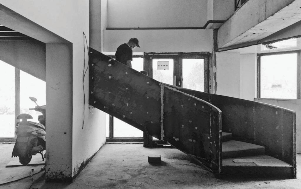
The project was completed in 2019. Design took three months and construction, almost one year. Milan and I are impressed by the clients’ patience.
“That was quite a long time,” De Geus admits. “The restaurant had to pay rent. They gave us an incredible amount of trust. My professor (De Geus studied under Chinese master architect Li Xiaodong at Tsinghua University) told me you first must become friends (with the client). If you cannot become friends, then you shouldn’t do the project. If you do become friends, then it will be a good project because you will want to make it good for your friend.”
How long does it take De Geus to become friends with a client?
“You become friends faster if you are genuine. If you are not hiding something. And I do find that we work better with genuine people, people not afraid to be themselves. ‘Friends’ doesn’t mean we’re going to hang out at the bar every day. ‘Friends’ means we trust each other—I got your back, you got mine.”

今后也请 (Life As It Is)
It was Dutch graphic artist MC Escher’s explorations of infinity that inspired De Geus’ vision of endless spatial discovery to replace the shophouse structure’s dim confines.
Another source of inspiration is a famous garden in the south of China, in the city of Suzhou, which, De Geus says, is “laid out as a visual journey.” At the park, it says, “‘With every three steps, you enter a new world’ because, with every turn you take, there is a new world awaiting you. So we tried to do that here.”
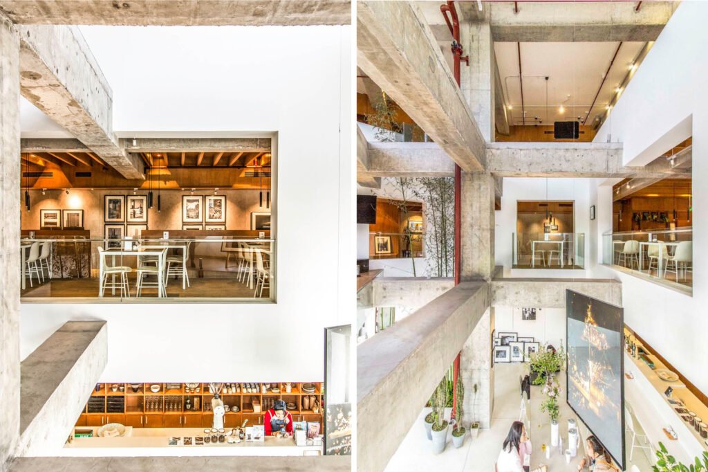
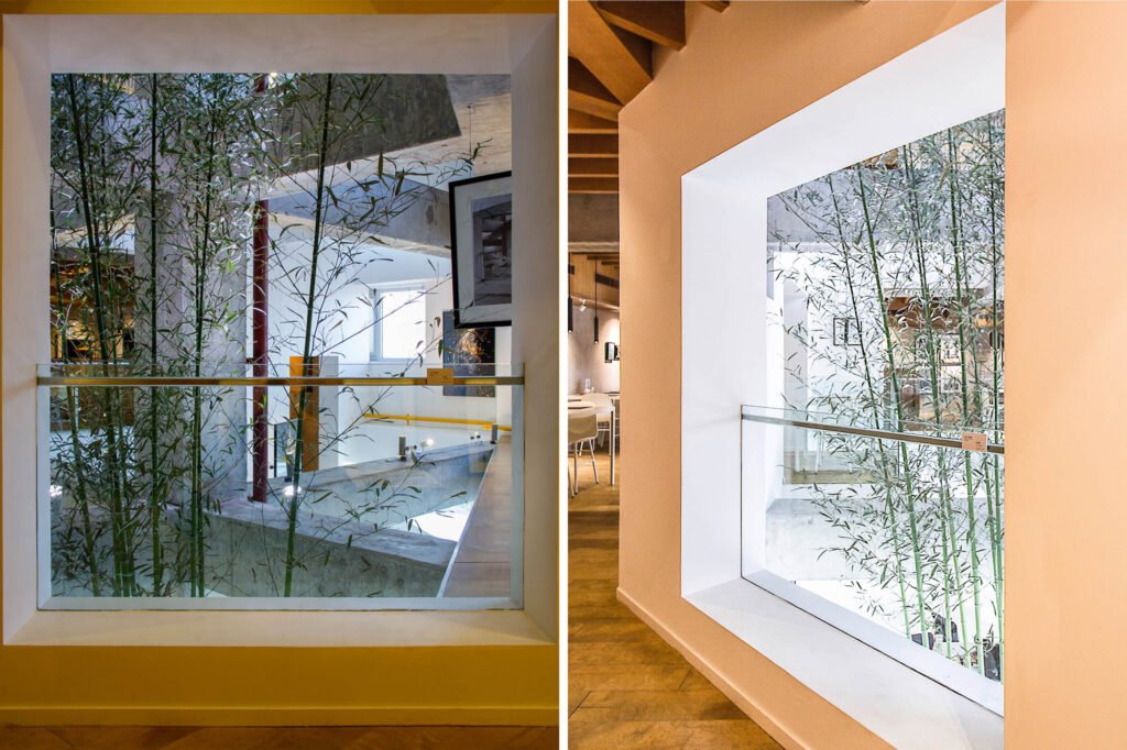
Tearing down the interior walls and floors of the three shophouses created a single open space. To this, De Geus inserted an interior “façade” with windows and balconies so guests could enjoy sitting near a window with a view or dine cantilevered in space.
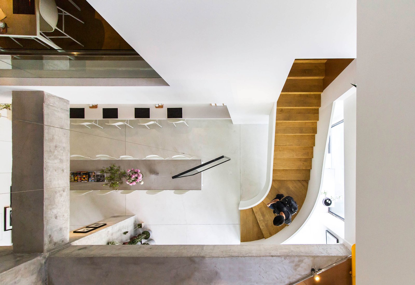
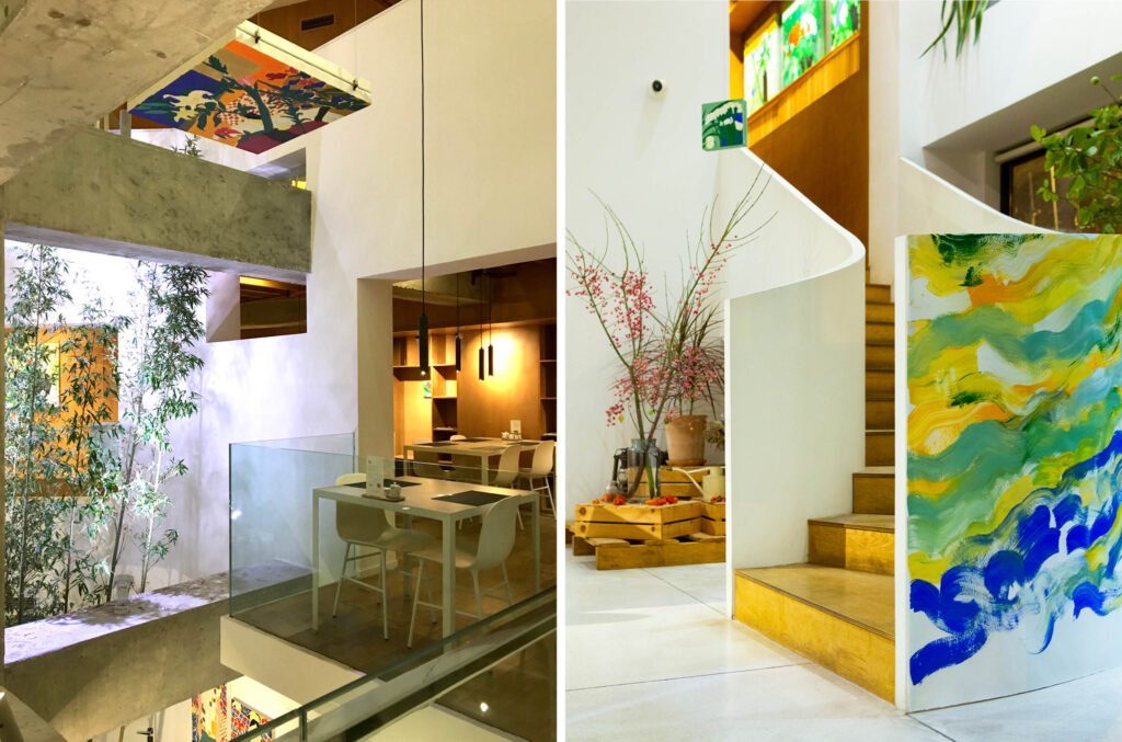
A curving staircase to the second floor and a staircase with a bridge traversing the atrium to the third floor form a loop for people to wend their way up the restaurant and its pure and honest spaces.
Instead of the restaurant being a series of stacked floors, Zhang says, it has become “a series of interlinked spaces in which we modulate and vary the function and privacy of each space.”
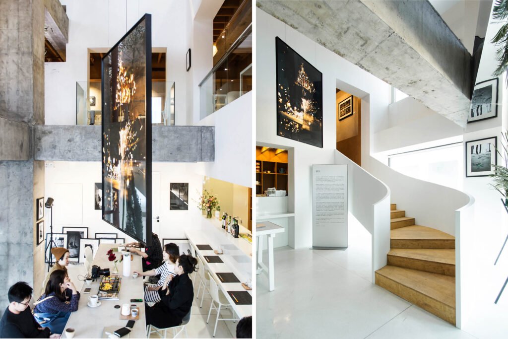
The brute concrete columns and beams remain exposed, De Geus says, as a “monument to the rigid constraints of daily life.” A stand of bamboo trees paints soft brushstrokes of green against the white surfaces and warm wooden spaces. Mirrors on walls and unexpected places serve as ‘paintings,’ and another means for guests to discover their environment.
My co-critic, Heidrun Milan, is so enthused about the changing vistas, he tells Zhang: “What I love about this project is the element of surprise. In every view, there is something new. You really did achieve your intent, ‘With every three steps, you enter a new world!’ Then he asks her, “What pleases you most about this project?”
She takes a sip of tea and tilts her head, remembering. “What pleases me the most is seeing people have fun in the space, which is not what you expect from the space of a restaurant. When you talk about ‘fun’ in a restaurant, you think about people’s conversations, the time spent with friends. But this is a space where people really have fun when they go through it.”
Zhang cites an example: “We went to a kid’s party there once. Our friend had a five-year-old son who decided to have his birthday party there. And the joy of seeing these kids run throughout the whole space! They would then stand at different points, at different levels, and talk to each other and do silly things. This, to me, must be the most pleasing thing I experienced in that space.
“I also love what a great, dynamic space it is for art. The owners wanted it to be a place to show art and artifacts that they love. One show was put on by a graduating student of the arts academy in that area, and it was just beautiful! He hung paintings from the ceiling, which you could look up at from below, or paintings you could view only from up high, looking down. He also painted the staircase. It was a magical experience. He showed me the potential of the space that I had not seen before.”
De Geus, who speaks fluent Mandarin, tells us that the restaurant gallery’s name in Chinese is just as magical. In English, they call the place LAII Gallery or Life As It IsGallery. “The Chinese name, 今后也请,” he explains, “is poetic and translates to something like ‘Already looking forward to seeing you again here in the future.’”
Milan and I look forward to the day that we can.
After each of our interviews with De Geus and Zhang (we interviewed them separately), Milan and I did a quick debrief on the subjects we covered and how we would critique the project. Here are excerpts of our email exchanges and a 30-minute teleconference.
Read our interviews with Martijn de Geus and Han Zhang, who share stories about events in their lives that shaped their design values and helped define the design philosophy of 汉荷设计/ maison h.

The critique
So, Heidrun, what’s the verdict?
I’m giving it five stars because I understand the space, how it works, and how their values are clearly reflected in the space.
No hesitation there! That wasn’t your rating when we were picking projects to review.
When we were looking at the website, I found the space cold because of the brutalist elements. As it was explained to me and as we got access to more photos—almost 50, I think—I began to understand the intent of the designer and how he used various stimuli to evoke emotions, and how the space narrates the whole visual journey.
I appreciated the design even more when I saw the drawings and construction photos, quite surprised that maison h stripped the structure down to columns and beams and transformed the otherwise claustrophobic space into one with so many views and a layout that is not predictable. The space isn’t square. Every turn, there is an element of surprise. Two or three steps forward, you see angled beams converging at a walkway. Two or three more steps, you see a space within a space within a space. And the momentum builds up as you go through each level, and you are rewarded with the view from the top looking down at the atrium with bamboos gently swaying.

I totally got what Han was saying—that on opposite sides of the interior façade, they had two entirely different worlds, one old, one new; one in white and gray and the other warm; one in stone and concrete and the other in wood and paper. I like the idea of shifting between two worlds. Full and void, moving and still, suspended and grounded. I like that they explored dichotomies. Because people aren’t only one thing.
I like how they solved the problem and used their values to solve the problem. Look at the wall to the left of the stairs. They didn’t have to put that wall with a window; they could have kept it open; they could have put a glass balustrade. But they chose not to. That strip of wall partially hides what is behind. So, as you go up the stairs, it builds anticipation. Ano kaya ang nandiyan? What’s up there? There’s still an element of surprise.
Right, they create a “reveal.” Not to mention, the feeling of looking out a window is more comfortable, more likely to put you at ease than sitting beside a glass balustrade.
It’s true what they said, with every three steps you enter a different world. There are so many things to look at, so many perspectives, yet the views are immaculate; they aren’t cluttered. The materials’ simplicity: white-washed walls, bare concrete, and wood allow the poetry of space to take center stage.
I like what you said about “a space within a space within a space.” You see many framed views that are framed again by beams and columns at LAII, but it doesn’t feel boxy because the space is deep. That depth was a problem they had going in, and now it’s an asset. The depth is still there, but no one feels deprived of space and light. What did you think of how they solved the problem when the first concept didn’t work out?
What I really appreciated about Han and Martijn is when they talk about how they design, they’re not obsessed with form and aesthetic. They focus on emotions and experience. And when a design is problematic, they go back to the basics.
Right. Solve the problem first. Don’t cover it up, don’t throw distractions, and hope people won’t notice the problem.
They don’t talk like other architects.
Haha!!
They are deeply concerned with people’s behavioral patterns and behavioral analysis. They’re not superficial. How I wish more designers would focus on that first, before aesthetics. How I wish we would give that greater emphasis in school.
Martijn said something like that. When we asked him how they design spaces that are loved. He said he learned from Herman Herzberger design enables certain behaviors. They design spaces to enable people to do what matters to them. And when they do that, it “doesn’t matter how it looks like anymore. It can still be beautiful or not, but it’s about how people will appropriate it.”
I care what it looks like because I believe that on a deep level, aesthetics is also an enabler, and I’m sure they see it that way too, because their spaces are just so beautiful. Oh! I would love to talk to them about that—beauty as an enabler.

What I’d like to know from you, Heidrun, is how you see their values reflected in the project.
I have observed that Maison H’s interior design is rooted in the concept of home, whether it’s a restaurant, a school, or a zoo. When you design a space to make people feel at home, it gives a sense of familiarity and hints at memories, and this is comforting. As Sashi Caan puts it, “Spaces that have emotional resonance can be said to evoke a range of responses—in some cases, almost an ancestral memory of a lost paradise, but also recollections of half-forgotten places we have passed through, as children or adults, that float somewhere in the backs of our mind. The search for shelter, then, is universal, but also, by its intimate nature, deeply individual.”
Ay! Ang ganda. That’s beautiful. There are places like that.
Martijn’s objective is for people to have a sense of belonging to a place to appropriate it as their own.
Yes, while Han’s overriding concern is to design spaces so that people are comfortable and behave naturally. How did you see this in the project?
I like the dynamism of the space. It allows the users to create new experiences. When I checked their layout and the gifs, you can move the tables around to make your own space. I like that you can custom it to your needs because this is a lifestyle center, so yeah, custom it to your event, to your day, to your mood. That’s appropriation.
I like how the atrium becomes an exhibit area and allows the users to view the art and installations from different points.
I appreciate the different-sized groupings. Some restaurants don’t have tables for one or two, it’s so awkward when you’re eating alone at a big table! That’s part of appropriation, isn’t it? Having different groupings so you can feel, “Oh, this is my spot.” Or when you’re with a date, the two of you feel, “This is our spot.”
The design brief from the owner was plain and simple, make the place like home so people feel they can come back any time. How the users appropriate the space and integrate it into their lifestyle indicates maison h has successfully delivered the design. Based on the pictures Martijn sent of different events that have taken place there, I would say maison h delivered more than what was asked.

How about the idea of designing for a friend? I find that Filipino. I’m delighted to hear he subscribes to that.
The friend concept, as suggested by Martijn’s professor, is about the relationship between the designer and the client. The foundation of friendship is built on trust. With LAII, it is evident that the client respected maison h’s design process by allowing them to work on the design for three months while the construction took them almost a year to finish. The client was involved in every step of the project, and that is what you call design dialogue. Like in every friendship, it must be two-way, and there should be a commitment from both sides.
What I’ve observed is Martijn and Han follow the best practices of both worlds. They come from East and West, and both have been influenced by East and West. Because they make a conscious effort to learn from both worlds, they have a deeper understanding of how design works.
And how the design process works.
Martijn compared Eastern and Western ways of working on a design project. The West is accustomed to a rigid, regulated system while Chinese culture allows being more fluid, which he likened to the art of t’ai chi. It’s all slow movements suddenly punctuated with an abrupt movement or punch. You let ideas play out in your mind. As Martijn says, you “massage” the ideas for a couple of weeks before sitting at the table. I think this also holds in our culture. Creatives can be slow or appear to be slow, and when the deadline is near, there is a sudden rush of adrenaline, and the ideas are drawn out on paper.
Which area of the restaurant do you like best and why?
The cantilevered dining areas. It gives you a sense of privacy and, at the same time, allows you to be a voyeur. After all, what is a dining experience without observing what’s happening around you?
Haha! I think the cantilever works the other way around. What’s a dining experience without other people gazing at you?


Which photos do you want readers to look at and what do you want them to notice?
I want the readers to look at the construction photos, the drawings (the gif and the section) to understand the design process, how they opened the layout, and gave each diner a unique view.
I’d like them to look at the staircase photos and those shot from above, looking down at the beams and tables. Note the simplicity of the materials, allowing imperfections to show, like the cracks in the concrete.
I also especially like the photo of Han shot from below, and she’s peeking out from the third floor while a guy is on the second-level cantilevered platform. I like the shot of her sitting at the table on the second floor with the large window as her backdrop. As well as her shot on the ground floor looking up through the bamboo leaves. These photos show the transparency of space and how the void was utilized to make a statement and let people breathe.


Right, right! All that empty space tells you, “You don’t have to hold your breath here. You can exhale. You are free. You can relax.” The void doesn’t give people space from one another but room to be at ease. You know, there’s enough oxygen here for everyone.
I also like the shot of people dining on the ground floor with a painting hanging in the atrium, shot from the stairs. This shows the appropriation of space by the users, making it their own personal cocoon. The photo also suggests different views and angles that create the whole dining experience.
How about you, Judith? Are you still giving it a five?
Oh, yes. I have no complaints. Except they don’t have photos of the bathrooms! So, until I experience the bathrooms, I’ll have to withhold judgment. Otherwise, it’s a five. •

Judith Arellano Torres is the former editor-in-chief of BluPrint magazine, which she led for ten years. She edited four books, Blueprints for 2050, Design Better, Tropical Architecture for the 21st Century Books 1 & 3, and co-wrote the latter two. Before BluPrint, Judith worked for 17 years in television in a variety of roles, including COO of the ABS-CBN News Channel (ANC); COO, executive producer, and editor at Probe Productions, Inc.; and producer for CNN International, covering the Philippines, Indonesia, Malaysia, and Singapore.
Heidrun Milan is an interior designer based in Tacloban City, Leyte, Philippines, with a practice that extends to the different parts of the archipelago. His studio expresses “the marriage of high modernism and sustainability inflected with homegrown aesthetics and pride of local craftsmanship and materials.” He is well-regarded for the psycho-social support activities he spearheads while helping disaster-stricken communities in Leyte rebuild their homes. He has won awards from the Philippines Tuklas Innovations Lab, the Design Center of the Philippines, the Philippine Institute of Interior Designers, and the Metrobank Art and Design Excellence competition.
Kanto.com.ph is a proud co-presenter of Anthology Festival 2021. This interview was produced in support of the Festival and its organizers, WTA Architecture and Design.