
Introduction and Interview Gabrielle de la Cruz
Images Terry Uy and Café Kitsuné
One of the greatest tests an interior designer can face is designing a space that is far from their usual approach and repertoire. This can challenge one to set aside familiar moves, recurring motifs and penchants to make way for what is new, alien, and untested.
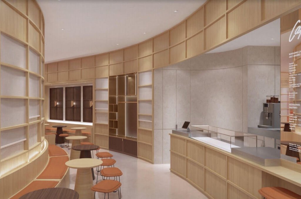
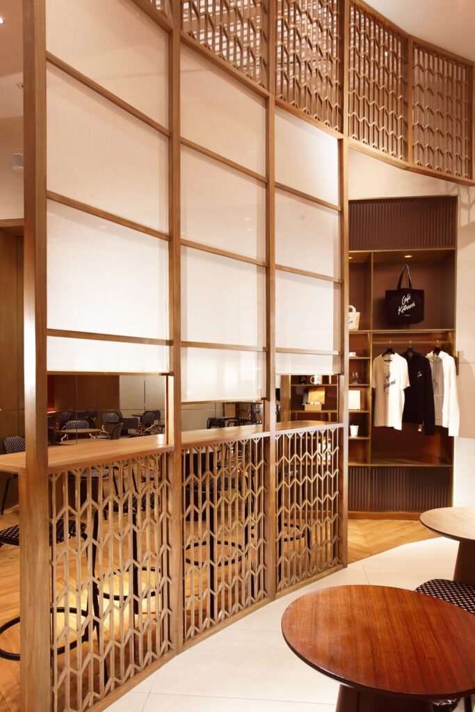
This is exactly what transpired when renowned Filipina interior designer Chat Fores of Chat Fores Design Studio was commissioned to put a face to the Philippine franchise of the French-Parisian brand Café Kitsuné. “My designs are usually bold and loud. I normally create an eclectic space by incorporating more than four finishes, various bold colors, and two to three defining elements,” shares Fores. On the other hand, the interiors of existing Café Kitsuné outposts are characterized by muted tones and warm finishes, reflective of a chic, classic, and sophisticated French lifestyle.
With plans and perspectives already set in place and directly coming from Paris, Fores narrates how designing the first Café Kitsuné in the Philippines brought her to further appreciate the beauty of pristine spaces and reminded her of the value of a space’s identity. “What I liked most about working with the people of Café Kitsuné is how they fought for their identity. They were firm on the materials and finishes that they want and just allowed those to speak for the space.”
Our conversation with the multi-awarded interior designer follows:


Hello Ms. Chat! How are you doing? What’s one furniture piece you’ve encountered recently that you couldn’t get off your mind?
Chat Fores: There’s this Italian furniture brand that I’ve always been interested in. The brand’s name is Nilufar and they make one-of-a-kind pieces that are quite colorful. They make lighting, funky furniture, screens, tabletops, and upholstery. They also have enlarged or ginormous-looking lucite wall sconces, but all their products come at very high costs.
I have encountered several pieces during a few trade fairs in Italy and it’s always a pleasure to see one because of the art that comes with each piece’s composition and overall build. I personally find them very beautiful, but I know that purchasing one would cost me a lot. I also feel like I might not be as fascinated as I am now after a year of owning one, so I might as well just adore the pieces from afar. (laughs)

A piece by Nilufar from their IT’S ALL ABOUT COLOUR exhibition, which is entirely dedicated to their 10-year collaborators Studio Nucleo. Image courtesy of Nilufar. Meisen Cabinet by Nilufar designer Bethan Laura Wood. Image courtesy of Nilufar.


I find your penchant for juxtaposing myriad colors and textures striking and it appears to be an overarching theme across your body of work. Would you say that this is an inalienable part of your design identity?
I wouldn’t say that the combinations and factors that I am used to working around are non-negotiable. I find that it’s always important for you to explore as a designer and that limiting yourself to certain aspects or styles won’t necessarily help you grow.
I wouldn’t have worked on Café Kitsuné if I wasn’t open enough. The design is fairly new and different from my style, but I learned a lot from the experience.

Can you recount to us how you got Café Kitsuné as a project? How and when did it all start?
My husband is a finishing contractor and we specialize in dealing with foreign designers or clients together. We’ve worked with brands such as Missoni Home, Versace, and Armani, designing some of their showrooms and even some of their actual buildings. I guess this was my edge, having dealt with big clients such as these, and knowing how to study their tastes and understand the rules in following their drawings.
Honestly, it was my husband who JR, one of the franchise owners, contacted first while they were putting up the café. He initially said no to doing the finishing because it was honestly a challenging undertaking. The project got caught in the midst of the pandemic and they were already nearing construction.
JR called me then. I know him because we met through WorldBex and we’ve been doing a lot of booths for them for years now. I said yes but asked him to give me leeway, as things like this take time. I also requested that I meet with the people of Café Kitsuné so as to establish that relationship immediately.
When I met with the people from the franchise, I told them that we are going to do our best and show them what we can do right away. What we did was create a really good mood board and provide them with various options while packaging everything well. Things spiraled from there, with us working to finish the cafe within 4 to 5 months.

Would you say that the timeline was enough? When was the project completed?
They contacted me around November to December 2021 and the project was completed around the end of June, with the café opening a few days after. This is honestly quite short considering all the things we had to accomplish, but it was part of the challenge that we had to overcome and work through since they had a target date for the opening.
Given that the timeline is within the pandemic, did COVID impact how the project was designed and executed?
In terms of design, we met the basics such as proper distancing. The café is quite small so we did our best to ensure enough spacing for everyone.
A disadvantage brought by the pandemic was that we were only able to physically meet with the people of Café Kitsuné when we were nearing project completion. I would say that it’s still different meeting with people face-to-face, especially in this industry where everything is visual. The truth about working with foreign franchises is that there is a lot of going back and forth for approvals. Especially if a brand already has its identity, you also have to be able to mirror that when you design their space.

In between all those approvals, what were their non-negotiables? Can you tell us more about the initial brief and which parts of it stood out for you?
The initial design came directly from Paris and I had to localize and improve it based on the site. I would say that the French are very detail-oriented and particular, as most of their non-negotiables are centered on material.
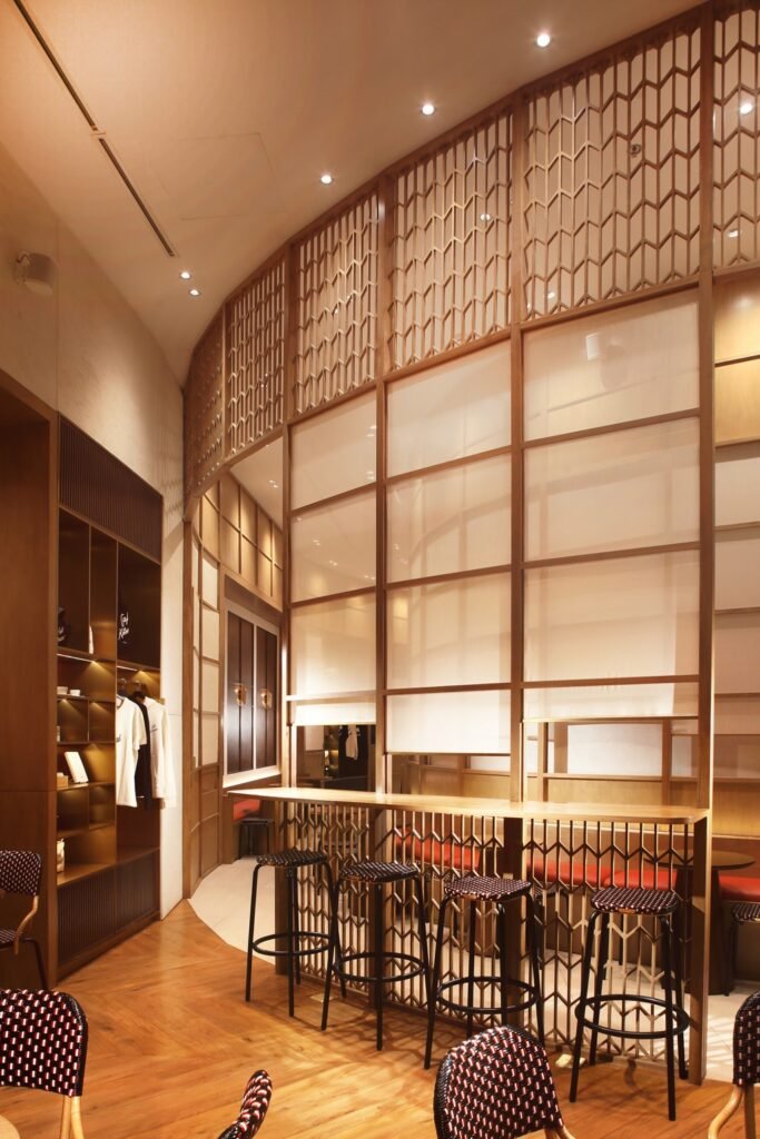
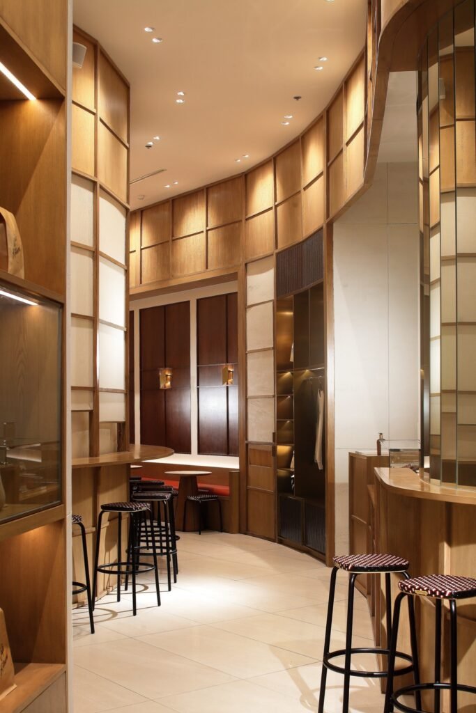
Some of these are laser-cut wood panels, which are the latticework you’d see in the café. At first, they also wanted all the walls in stone, but we were able to help the franchise owners cut costs by having ¾ of the walls in decorative paint finish. Oikos paint was used to mimic the travertine stone. You will notice that by the bar, as you enter.
The gold metal panels had to be ordered from Hong Kong, and the front door had to come all the way from France. The woven chairs had to be delivered to the Philippines as well.
Amidst all these, the good thing about working with the French is that they are very appreciative. When you work with foreign groups, the best thing to do is to really follow them while still sharing your input. I was very lucky because when I submitted my working drawings to them, they approved.

Speaking of your drawings, how did you work around the given space? Were there special features or constraints that the space presented that wound up affecting your design?
There wasn’t a single factor that affected everything design-wise. Of course, the technical aspects such as measuring all those curves in the space were a bit time-consuming, but I had my husband worry about and take care of them. (laughs)
We did have to re-plan the overall layout of the café. We had to work on everything on-site. The kitchen was originally placed at the back, we had to squeeze in a bathroom, and we had to make changes with respect to the French café culture.
In France, people don’t stay in coffee shops the way we Filipinos do. They come for their drinks and treats and experience the space for a while, then they go. Café Kitsuné wanted to share this culture with us, so this informed the concept of the interiors. The narrow yet well-lit entrance is meant to entice people and invite them in. The bar seats placed at the front counter allow guests to stay for a few minutes as they enjoy their food and beverages.
What would you say is the statement space of the café? What is your favorite area?
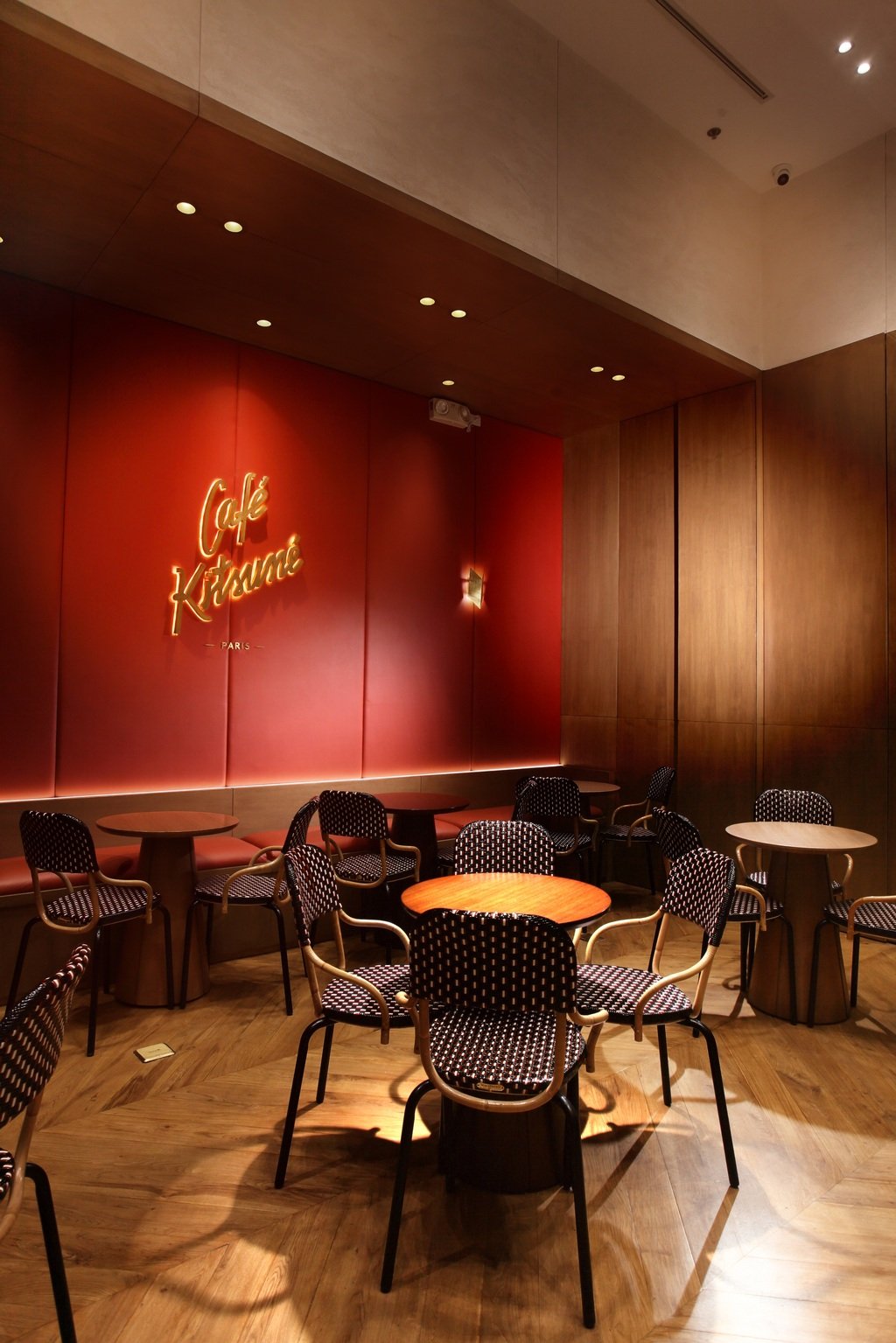
My favorite area is the banquette seat in orange. It’s just so simple yet vibrant. That is also where there is least activity in the café, yet you can see everything from there.
Statement areas of the café include their shelves, which contain some of their branding items. Of course, the entrance is also a huge statement.


Can you share some of the learnings and insights you picked up on the project, particularly the ones that relate to your field of work and how it is practiced?
One is that we can always experiment, especially in terms of layout. As designers, we shouldn’t be afraid in trying different layouts even if it means challenging ourselves and challenging others to accept it.
It’s also good to try using a similar finish for various purposes and in different techniques. You can always take a similar finish and enhance it by trying it in different textures such as rough, smooth, matte, or glossy. This way, you get to explore various outcomes.
Don’t rely too much on what you see. You’d be surprised how your design can turn out better than those that are trending.
I also learned how to be more patient and to not attack things right away. When you’re emotional towards something, wait before you react. Especially with foreign collaborators, they often have their own way of reacting to things and language barriers can always come in. Sometimes, when they repeatedly say the word “no,” they don’t always mean that it’s bad. They could actually mean “wait, let’s try something else.” It can strike you off in the wrong way, so you always have to keep in mind all the cultural differences and take a pause before you act on anything.


Is this your first time working with a French brand? Do you see yourself working with more French brands?
Yes, this is my first time. Hopefully, I get to work with more and venture into other styles.
They are actually eyeing to put up more branches of Café Kitsuné all over the Philippines. This isn’t urgent and it will likely take years, but it is something that I am looking forward to as well.
If there was one design quality of Café Kitsuné you’d like people to pick up, what is it?
I hope people will be inspired to try and understand what the word ‘aesthetic’ really means. I think it’s about time we veer away from Pinterest inspirations and make our spaces more diverse. Gone are the days when most people passionately tried to figure out their lighting effects, the drama of colors, and other elements of design such as balance and harmony.
Not everything has to be ‘#instagrammable’ and we can always shy away from trends. We can always simplify by making textures, finishes, and materials stand out in our designs. We can revisit our practices and learn from how old ways defined our spaces, such as how broken walls used to be the characteristic of a place.
The people of Café Kitsuné fought for their design identity and I now understand why. If a space has found its design identity, it is important to stick to it. That look will be its trademark. •
Gabrielle de la Cruz started writing about architecture and design in 2019. She previously wrote for BluPrint magazine and was trained under the leadership of then editor-in-chief Judith Torres and previous creative director Patrick Kasingsing. Read more of her work here and follow her on Instagram @gabbie.delacruz.
3 Responses