Interview Patrick Kasingsing
Images Serious Studio

Hello Serious Studio! We meet again! How’s the pandemic treating the team?
Kookie Santos: Our team has been doing good. We are all trying our best to handle this year adapting the best that we can to everything that comes along our way. Throughout this pandemic, our studio has thankfully been getting a steady flow of projects.
It has pushed us [all in the Studio] to adapt, re-evaluate, and refine all throughout this period. It’s been a cycle of testing out and improving systems that help us to continue working collaboratively, especially at a time where we are not able to physically work and interact with each other for an indefinite time. We’re all trying our best to see how the studio can grow and be better, collectively and as individuals. It requires us to be more patient, open, and understanding with each other throughout the process.
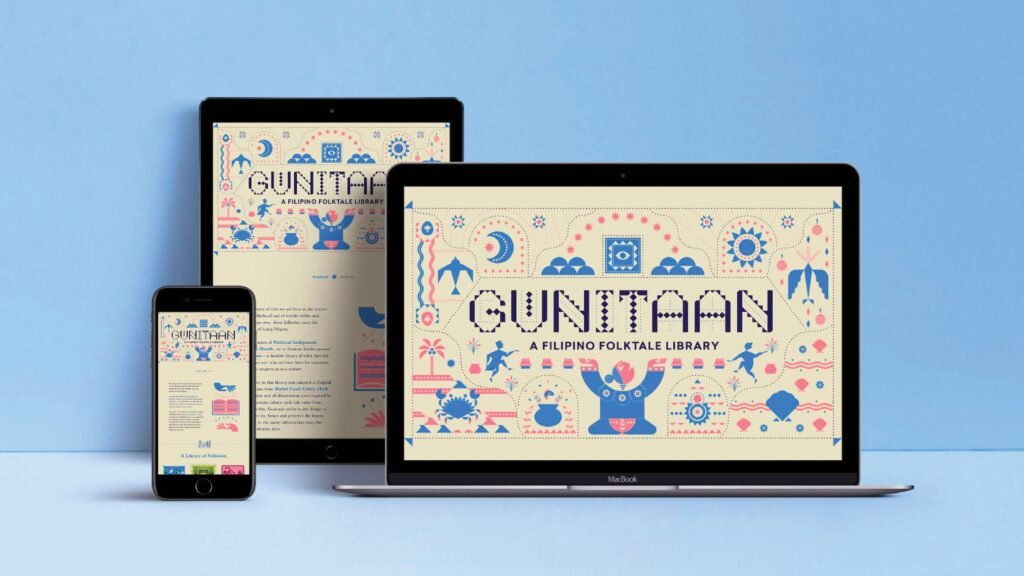
Let’s talk about one of your latest projects, done in collaboration with PAGASA PH and Bad Student. Gunitaan is a zine on traditional Filipino folktales both printed and available as a digital download. How did this collaboration arise?
Kar Abola: It started as an idea for Buwan ng Wika last August. We asked ourselves how we might celebrate Filipino literature and culture with the skills that we have. Eventually, we arrived at the focus on folktales. They’re not only perfect to celebrate our culture as it was lived and retold every day, but they’re also super fun to explore and design for. The initiative just grew and grew as we were developing it so we decided to launch it at the end of October instead, for National Indigenous Peoples Month.
On PAGASA. We also wanted to make sure this all went back to those who keep our cultures and our folktales alive — our indigenous peoples. We tried our best to make sure that everything we did was as respectful as possible and that any proceeds we would generate will go back to them.
So we set out to look for a partner that could help us do this. We reached out to PAGASA, and they were game. We also really, deeply appreciate how they approach each indigenous community, working with ground partners to make sure they’re culturally sensitive (e.g. Aetas don’t eat anything red, so they don’t send sardines to them) and actually responsive to each community’s specific needs, whether or not this involved their standard survival packs.
At the time we reached out, they were supporting Aeta, Lumad and T’boli communities. But when the super typhoons hit, we discussed that proceeds could also go to the various IP groups affected in Buhi, Camarines Sur.
On Bad Student. Our partnership with Bad Student felt like just the right thing at the right time. We were looking for a way to further encourage donations and thought that a print and tactile version of the stories would be really meaningful and actually fun to make. Individually, our team already loved Bad Student. We love the great work they do and saw how much they had done for local design and independent publishing. Kookie had just attended their riso workshop as well. So, we asked them if they’d be interested. Not only did they say yes, but they also suggested to put the zine in the Tokyo Art Book Fair to rep Philippine culture. In the end, they helped us magnify the vision of this project even further through print and design.
So when we heard about how their home and studio were destroyed in the typhoon, it really broke our hearts. We asked PAGASA if we could allot a portion of the proceeds for their recovery, and they heartily agreed. It was so inspiring to see the industry come together to support Bad Student; even our customers sent so many messages of support.
Kookie: This response of our local design community represented the best of Filipino creativity. We saw Filipino creativity in action when we witnessed how different local individuals and groups came up with their own fund-raising initiatives to help Bad Student, and other typhoon-affected communities get back on their feet again. The local design industry is constantly evolving and thriving in thoughtfulness, kindness, and generosity. The desire and initiative of Filipino creatives to act and to give back is a representation of the best things about our local design industry thus far. We are hoping that Bad Student comes back soon, ready to continue their vision of representing Filipino design and creativity to the Philippines and to the rest of the world. They’re still raising funds to get their studio up and running, and we hope you can check them out on IG to find out how to support them further.
What was the process like for sourcing the stories?
Kar: We originally wanted to directly get in touch with indigenous groups but this proved to be very difficult, and we didn’t want to put more pressure on them on top of dealing with the crisis. So we looked for other possible references. This needed to be in the public domain so we could adapt it and redesign it for the project. Eventually, we found Mabel Cook Cole’s compilation from 1916 on Project Gutenberg. It was tough to get through. But as we dug deeper, we found really fun, interesting, even silly stories that just needed a little push for more people to appreciate them. Our final list is made up of nine stories in total, three each from Luzon, Visayas, and Mindanao intersecting with three themes we found common in the compilation — celestial, creation, and animals.
In terms of immersing ourselves, I’ve been doing research with indigenous groups outside of the studio so I brought a lot of that into the project, informing our motivations and creative inspirations. It was also a continuous discussion between Kookie and me, delving into online and offline resources about each group, to try and understand the context of each story and how to bring that out in the way we wrote and designed each folktale. Through this, we were able to find out, for example, why certain folktales were set near rivers or that creation folktales actually corresponded to real-life places. You’ll also find a lot of textile icons and patterns in the illustrations. These illustrations aren’t 100% accurate but are instead our humble attempts at showcasing the many, many cultures that exist in our country. Our goal was to present the folktales in a contemporary manner, while still keeping the spirit and beauty of our indigenous symbols.
We also adapted the original early 20th century English to something a bit more like what it is today. Aside from that, it was also really important for us to write it in Filipino. We translated each story and consulted with Zyron Oviedo to help make sure our Filipino grammar was sound.

What inspired the artistic approach for the beautiful illustrations? How are they evocative of our rich storytelling tradition and rich indigenous culture?
Kookie: It started when we were reading through the Cole compilation, which covered different areas around the Philippines. It was so fascinating for us to uncover the lush and vibrant storytelling of our indigenous cultures. They used storytelling to creatively find meaning in the way their world works. We admired their rootedness and awareness of the natural world, and how this deep respect for it enabled them to tell stories that investigate where things come from, why things work the way they work, and what values a virtuous person should avoid or uphold.
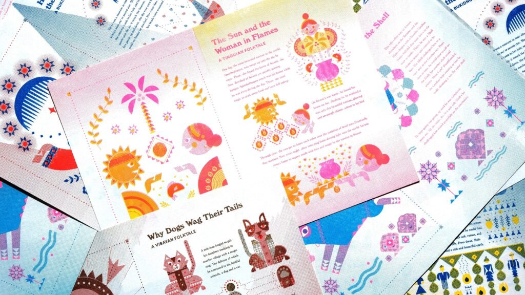
For example, The Carabao and the Shell is a folktale by the Tinguian people who are mostly in Abra. There is a big river there where the Tinguian were said to live, which explains why the race between the carabao and the shell was set along the riverbank. Another example is The Battle of the Crabs and the Waves which attempts to amusingly explain why crabs move back and forth by the shore. The details in stories like these showed the observant curiosity of our indigenous cultures to the world around them. Upon reading through these stories, we saw the potential to tell these stories in a more compelling and visual way so that these blocks of text can come to have a life of their own. We wanted to make the storytelling more interactive by using the thoughtfulness of design to further immerse the readers into different worlds per story. This is why we wanted to create bold and vibrant illustrations that attempted to portray the creative imagination of our indigenous cultures.
System. The illustrations were formed through the coming together of geometric shapes and lines that bear a similarity to our weaving and crafting culture. Through this illustration style, we were able to integrate the indigenous symbols more seamlessly into the characters, clothing, objects, and ornaments. Each story is comprised of a tricolor combination that allowed for a unique and simple distinction between each other. But while each story has its own color combinations, these colors were derived from a larger overall color palette which ensured that the stories when put together are still cohesive. The combination of the shared geometric illustration style and wide color palette allowed us to come up with a system that was flexible yet consistent throughout the whole project.
Key Visuals. We started out with the application of these visual elements onto the covers of each folktale. It was also important for us that each cover would be an overall peek or summary into the folktale. We wanted each cover to encompass the story of the folktale so that when they are placed together in one space, readers will be able to have a clue on what each folktale is about. For this project, we wanted people to be able to clearly judge the book by its cover.
Story Art. Once the covers were done, we proceeded with the story art for each folktale. With the covers to guide the visual direction of each folktale, we were able to apply the illustrations to tell the story even better. We took note of which sections best needed accompanying illustrations. By doing so, we were able to tell the story into better and more easily understandable chunks.
Designing by Medium. With an awareness of the medium, we were able to tailor the illustrations to interactively tell the story better. Because readers would be scrolling through the story, we had to ensure that each folktale had the proper distribution between text and images to keep the reading experience compelling all throughout.
We applied awareness and respect for the medium throughout the whole project. Having to tell the story through website, PDF, Instagram Stories, and print all had their own thoughtful details. It may sound small, but this attention to detail allowed each medium to have a special life of its own. For example, while the PDF format was more static, the Instagram Stories format made use of animations on each cover to further bring the folktales to life. Because both PDF and Instagram Story formats were going to be accessed mostly through mobile phones, we made sure to leave thumb markers and clear space on each page, ensuring that readers can optimally read the stories.

The print format also had a different charm and life in itself. Because the experience is more tactile, it was important for us to choose a printing approach that would make each page turn meaningful art pieces in themselves. The raw and gritty imperfections of the risograph approach were perfect for us as the output of this printing process would allow people to appreciate and investigate the organic details of the illustrations. Not to mention that the opportunity to collaborate with Bad Student was also a big reason for us choosing this medium. We wanted to promote an aspect of Philippine culture through this project, and we thought that it made sense to partner up with a studio that believes in the same purpose as well. By doing so we would be able to not only promote the beauty of our past and heritage, we are also able to promote the current movers of Filipino culture heading into the future.
Overall. The artistic approach of the whole project developed progressively. It unfolded all throughout the process. It was through the collaboration between team members that we were able to refine and improve every detail to be more thoughtful and intentional.
With Kar as the project lead of Gunitaan, she made sure to tie the whole project into something bigger than itself. Strategizing on the different components of the project, organizing the details, re-writing the project write-up and stories in both English and Tagalog, researching on each folktale and community to help with the direction, finding ways and partners to tie the project into helping communities, making sure that all timelines were on schedule, fixing the way that the project should be communicated were just some of the many things she did to lead the project as smoothly, seamlessly and as meaningfully as possible.
As the design lead, I was then able to visually communicate the needs of the project, guided by the strong vision and direction of the project. Angie Chua helped the visuals fully come to life by being responsible for creating the animations for the website and other digital executions. She was also able to apply the overall creative direction to some of the covers.
The rest of the studio’s support also made every detail of the project possible. The collaborative effort of everyone in the studio, led by the project team, made this whole project possible, which was one of the most inspiring things throughout the process. It was a journey of discussing, communicating, and checking in with each other, which led the project to continuously improve and refine. We were reminded of how everybody in the team’s support and distinct forms of strengths and creativity, contribute to the beautiful whole of the Gunitaan project. The getting there was as beautiful as the output, so we definitely have a deeper respect for the patience and process required to come up with a project like this.
Ultimately, the thorough application of intentionality and thoughtfulness that we applied to the project was born out of deep respect for the stories told by our indigenous cultures. We wanted to give each folktale justice, ensuring that we could tell each story to the best of our abilities. We wanted readers to appreciate the folktales as much as we did while we were going through the process. Lastly, we wanted our project not to solely be the end output, but to be a starting point for people to be curious about what our rich indigenous cultures have to offer. We want this project to be where people could bring their own process of discovery and exploration so that our cultural resources can keep on growing.

Why is it vital to preserve these stories now rather than later? From your experience putting this project together, what do you think can be done to ensure the longevity and relevance of such stories to its listeners (mostly children) in this age of digital screens?
Kar: There is a huge challenge in documenting our intangible cultures that needs to be addressed as soon as possible. We can’t preserve what we don’t know, what more appreciate it. This was our small contribution towards that. Another thing we tried to do is find ways for the stories to be where people already are, thus the many mediums across Instagram, mobile, web and print. The idea was to somehow make heritage part of our lives because it keeps getting relegated into a past we’re only taught to view from afar. Something to only watch, instead of something to participate in. So I think the key might be in the balance of respecting and honoring these longstanding cultures, while making it part of the everyday life of more Filipinos. Everyday life is also where these traditions and stories were born from and sustained. So we thought we could find a way to somehow do the same today.
Aside from the urgency of the challenge, I think now is a really great time to do this because of the growing interest in indigenous cultures in the local creative scene. There seems to be more critical discourse on how we can decolonize design and, in general, just a more conscious understanding of our role as designers and creatives to work for the good of people. We’re really so inspired by how the industry has embraced this and we’re just so lucky to be part of it in this moment.
What is your desired reaction/end goal for this project?
Kar & Kookie: When we started, we really just wanted to honor and celebrate our culture. We wanted to be really intentional with how we did it by making each component as meaningful as we could, not just to the general public, but also to our indigenous peoples.
We wanted to show how rich our cultures are, both in the beauty of our indigenous symbols and also in what they mean for people. We hope the stories show what our indigenous cultures value, how the stories are so rooted in their surroundings, showing a deep respect for land and nature and what it brings to them. We hope to show how incredibly creative Filipinos are from the past to today, most especially through the stories that we tell. We also wanted to show that indigenous cultures aren’t at odds with contemporary design. Overall, we hope to encourage more Filipino creatives to appreciate, protect and promote the beauty inherent to our cultures. As we mentioned earlier, it’s something that’s already definitely happening now and it’s been exciting to see the different ways people are representing who the Filipino is.

What inspired the zine format? Why would you say this is the most effective form to promulgate your cause?
Kookie: The zine came from the goal of making the library accessible in as many formats as we could, especially as we’re trying to raise donations through it. People can donate any amount for a downloadable PDF, or they could opt to get a limited-edition risograph art zine for P750. Because of this, we wanted the print experience of Gunitaan to have a premium and valuable tactile experience.
The zine was also influenced by our decision to choose the risograph printing approach. While we wanted the print component to be a premium experience, we also had to consider cost-effectiveness and reproducibility so that we can give as much as we can to the communities PAGASA supports. Not to mention that the risograph approach is also more environmentally sustainable from its use of natural inks (rice ink), to the machine’s lower energy consumption, to the Riso brand’s value for lower environmental burden. The combination of these characteristics exemplifies Filipino resourcefulness and practicality while retaining the craftsmanship and quality of the output.
There is also something very Filipino about riso. It is a widely used printing technique precisely because of its cost-effectiveness and efficiency. To play with this printing approach creatively would be to find beauty in the things that are inherently Filipino. The output then becomes a manifestation of classic Filipino printing techniques combined with a contemporary innovation of the craft. This too, is what we wanted to do with the project as a whole: taking in the gifts of the past, and reimagining it into the present and the future.
With the help of Bad Student, we believed that the print component of Gunitaan would come to life in ways unimaginable. Promoting local culture did not only mean highlighting the Filipino folktales but also highlighting current Filipino talent and creativity. Heritage must be passed on and moved forward by the current culture and communities around us. In a way, the creative collaborations and partnerships that we forge with people and groups bring in a new kind of breath and life that make initiatives more meaningful.
Are there plans to take this initiative further? Will there be new installments featuring tales from other indigenous groups?
Kookie: At the moment, we don’t have set plans yet. Our priority right now is to raise as many proceeds for PAGASA through the project. However, we’re trying to learn as much as we can with the reception we’re getting. We are seeing how design has an opportunity to play a very important role when it comes to communication and awareness. One thing is for sure: We’d love to explore other ways we can promote Filipino culture through design.
What are some of the challenges you guys experienced working with risograph? How is this publication approach the perfect fit for this project? Were there some surprises along the way?
Kookie: One of the biggest challenges for us was learning and adapting to the workflow of the risograph process. While risograph works produce such beautifully vibrant colors, the machine actually reads color in grayscale. Another interesting challenge was maximizing the use of a limited number of inks to produce more depth and colors through blending and manipulation. For example, even though we only used two ink colors on each story artwork, we could create various levels of saturation for one color to create lighter or deeper shades and we could also blend different colors of different saturation levels to create “new” colors out of the two inks. It asked of us to be resourceful within the constraints of the process, and it made us more creative with it by doing so.
Part of the approach was also respecting the limitations and characteristics of the process. Huge background colors can’t be as vibrant and dense because the ink will take a while to dry on the paper; overlapping colors won’t necessarily fit perfectly on top of each other; what works on the computer screen may not necessarily perfectly apply on the risograph print, and that’s okay. The process was a practice of letting go of full control and letting the limitations of the medium create a raw charm of tactility, craft, and experience to it.
The raw and gritty imperfection of the risograph was perfect for the print component of Gunitaan. We didn’t mean for it to happen, but the contrast between the digital and the print components of the project brought out distinct storytelling experiences by the difference in medium. While the digital component was bold, clean, and polished, the print component came out raw, textured, and tactile. While the digital component’s strength was in its interactive storytelling in relation to the screen, the print component’s strength was in the very pleasure of touch and sight—every page turn asks of you to appreciate the charm and characteristics of the risograph medium. The risograph print invites people to immerse and take their time into the details of the artwork.
How has the project enhanced the team’s understanding and appreciation of local culture and tradition?
Angie Chua: As someone who is not as familiar with indigenous culture, it was interesting to develop modern/contemporary illustrations based on the indigenous patterns. We took inspiration from Filipino textiles and we made sure to use specific elements appropriately. The experience allowed me to further appreciate Filipino culture. It would be really good to have more initiatives that would celebrate and create more awareness about the different stories Filipinos have to tell in a more contemporary way.
Kookie: For me, it was realizing that we as Filipinos have had this creativity all along. We just have to slowly rediscover it through a consciousness of the past, an awareness of what we have in the present, and a vision for a future that empowers being rooted in our culture. It was amazing to learn about indigenous peoples’ respect for nature and knack for creativity and storytelling. I’m blown away by their knowledge of the land, their awareness of the natural world around them, and how they’re able to tell stories based on that. I really look up to the way they craft and create, their respect for the process, and the quality that comes out of intention and attention to detail.
There is always an identity crisis when it comes to what Filipino design is — embracing unity in diversity, appreciating that we are many things in one. Acknowledging our cultural characteristics and strengths as an archipelago means that we can highlight many facets of our identity and that they don’t have to be one neatly packed identity, but an ever-growing and organic visual culture. There is just so much beauty in our country and sometimes they are hidden in the nooks and crannies of our history and in our daily lives. Design helps clarify the message or to communicate these things meaningfully to more people.
Kar: I’ve been exposed to our weaving cultures for a while now because of the research I do. It has been immensely inspiring to see how an incredibly intricate craft is passed on almost entirely verbally, to witness how deep their practices go, and to understand the difficult truth that this is all tied to their survival yet it’s almost never enough. That too was part of the conception of this project, the intention of not simply “taking” from cultures that weren’t wholly ours as Manileños and doing the work to somehow “return” it back in whatever way we could.
Also, because we looked into specific indigenous groups for this project, it gave me a better understanding of where these weaving practices came from and what context they were born in. I understood better why certain weaving patterns/symbols were so prevalent. They were putting their life, their community, and their spirituality onto fabric. I hoped and wished more people could see this, that more people could protect it and preserve it. The challenge will always be in how to get more people to appreciate this so that our traditions don’t die. Like Kookie said, this is where we saw design come in. Design really is a practice in empathy, so we tried our best to put ourselves in the shoes of indigenous peoples, the general Filipino public, and even other people around the world, to understand how we can bridge the traditional with the contemporary.
Lastly, we asked our team about this and it was really 😢 so heartwarming to learn how it made them feel. Our strategist Paolo talked about how his classmates made fun of one of the stories in high school and how Gunitaan helped him “unlearn” and “learn” things about our culture. Our ops director Sel said her Filipino friends abroad received it really well, as something that stays with you and speaks volumes about who we are.
What truths about design did the experience reveal to the team? How would you use these newfound learnings moving forward?
Kar: I think we’ve always held this belief that design could play a big role for change. We’ve had a taste of this through some clients, but we’ve never really had the chance to see how far we could take it if we did it ourselves. It was an exercise in practicing what we believed about design, creativity, and culture. It was walking the talk for some of the things we taught our team and our interns.
Kookie: For me, it’s the ability of design to bring out the best in things, in this case, our indigenous cultures.
Kar: Things that were already there but were just hidden in plain sight.
Kookie: From where we began with the Project Gutenberg document, we really put a lot of thought into how we can design and alter the experience into something more meaningful and something that people can appreciate more. Design has the ability to move cultures forward, communicate, frame, and highlight things that may just be hidden.
Recently, I’ve also been so motivated and inspired by different designers and creatives who contribute in their own ways to typhoon relief. Connection and collaboration and camaraderie within the local design community widens the reach of design. I’m so thankful for such a supportive local community.
Kar: It wasn’t just through this initiative but also through the time that we happened to release it. This moment when people are embracing our indigenous cultures and this moment when so many creatives are coming together to do what we can for people who need help.
Kookie: It just shows the power of design to move for change, and to inspire action. Design can shape perception, especially when done for good. But also remembering that shaping perception is a responsibility so we have to use it wisely.
Kar: Yes, design has so much power to shape how people feel about something and how they see the world. That power rests with us as an industry, and it’s up to us what to do with it. We wanted to make our culture proud and to respect the inherent dignity of who we are as diverse peoples. We wanted to push design forward, challenge what it can do, and join so many others who are now also using their creativity to shape a better world. Hopefully, we get to do more projects like this in the future. •
More on the Gunitaan initiative and other Serious work at serious-studio.com/gunitaan-tungkolsaaklatan-eng